Clustering New Addis Ababa 'Sub cities': A Guide for Data Collectors
A potential efficiency boost for data collection in Addis Ababa.
By Natnael Getahun in Survey Geospatial Analysis
July 10, 2025
Introduction
The idea for this project came to me when I was working as a research assistant intern at the East African Trading House plc. We were collecting data from local shops. With population information being scarce, we were told to sample from clusters using the administrative sub-city classifications of Addis Ababa. About 100 samples were going to be taken from each sub-city.
I had a few problems with this method. As can be seen in the Addis Ababa map below (the fully green map), not all sub-cities cover the same area. Some areas with about the same population density across the whole area but difference in areas were given the same amount of sampling size. This didn’t make sense to me. So I set out to create a better way of clustering in Addis Ababa. You may see this as a mission to create new “sub-cities” that make sense from a statistician’s perspective.
Aim of the project
- Find the optimal number of clusters of roads with high density and proximity to cover (without additional metrics like income, population, etc. considered)
- To get the most effective way of clusters to cover the whole Addis Ababa (with only road proximity consideration)
- To find the geographical centres of those clusters
Using OpenStreetMap boundaries and clustering algorithms like KMeans, I attempted to generate practical groupings that could better reflect urban layout than the administrative zones alone.
I used python throughout this project.
#importing needed libraries
import numpy as np
import pandas as pd
import geopandas as gpd
import matplotlib.pyplot as plt
import seaborn as sns

import osmnx as ox

from sklearn.cluster import KMeans
from sklearn.metrics import silhouette_score
from sklearn.preprocessing import StandardScaler

import plotly.express as px
import plotly.graph_objects as go
Step 1: Getting the Data and Exploratory Data Analysis
I started by downloading the administrative sub-city boundaries of Addis Ababa using osmnx.
# Define location and tags
place = "አዲስ አበባ Addis Ababa أديس أبابا, ኢትዮጵያ إثيوبيا"
tags = {"boundary": "administrative", "admin_level": "30"}

# Load subcities as polygons
gdf = ox.features_from_place(place, tags)
gdf = gdf[gdf.geometry.type.isin(["Polygon", "MultiPolygon"])]
gdf.plot(figsize=(8, 8), edgecolor="black", color="lightblue")
plt.show()
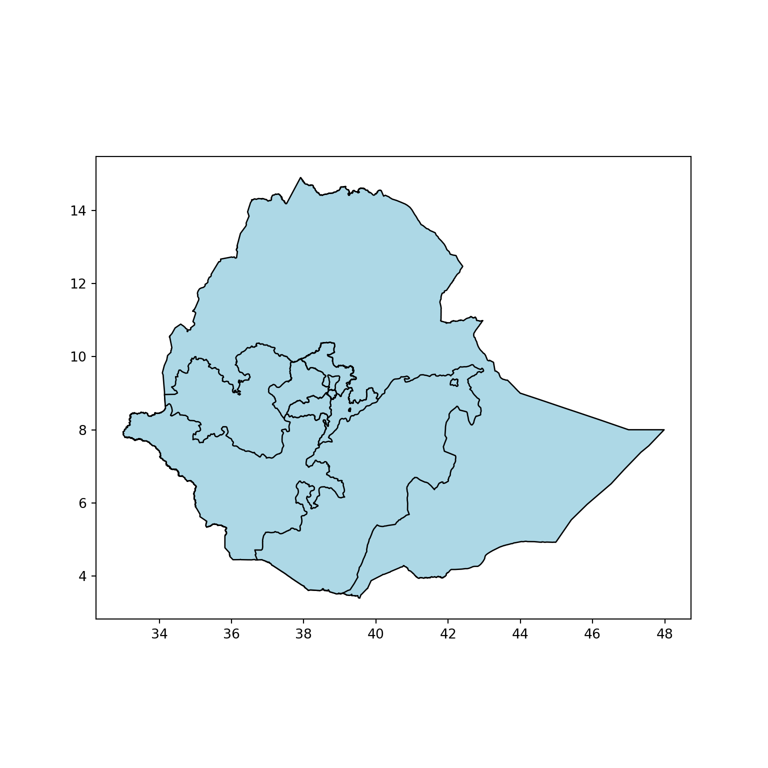
As you can see, the code has given areas outside of Addis Ababa as well. Next, I filtered out polygons that are in Addis Ababa only.
#filtering only sub cities of Addis Ababa (no Lemi Kura in openstreetmap's data)
gdf_filtered = gdf.loc[gdf["name"].isin([
    'Arada', 'Bole', 'Addis Ketema',
    'Kirkos', 'Gulale', 'Lideta', 'Yeka',
    'Nefas Silk', 'Akaki Kaliti', 'Kolfe Keranio'
]), ["name", "geometry"]].reset_index(drop=True)

# Plot with color and figsize
gdf_filtered.plot(edgecolor="black", color="lightgreen", figsize=(8, 8));
plt.show()
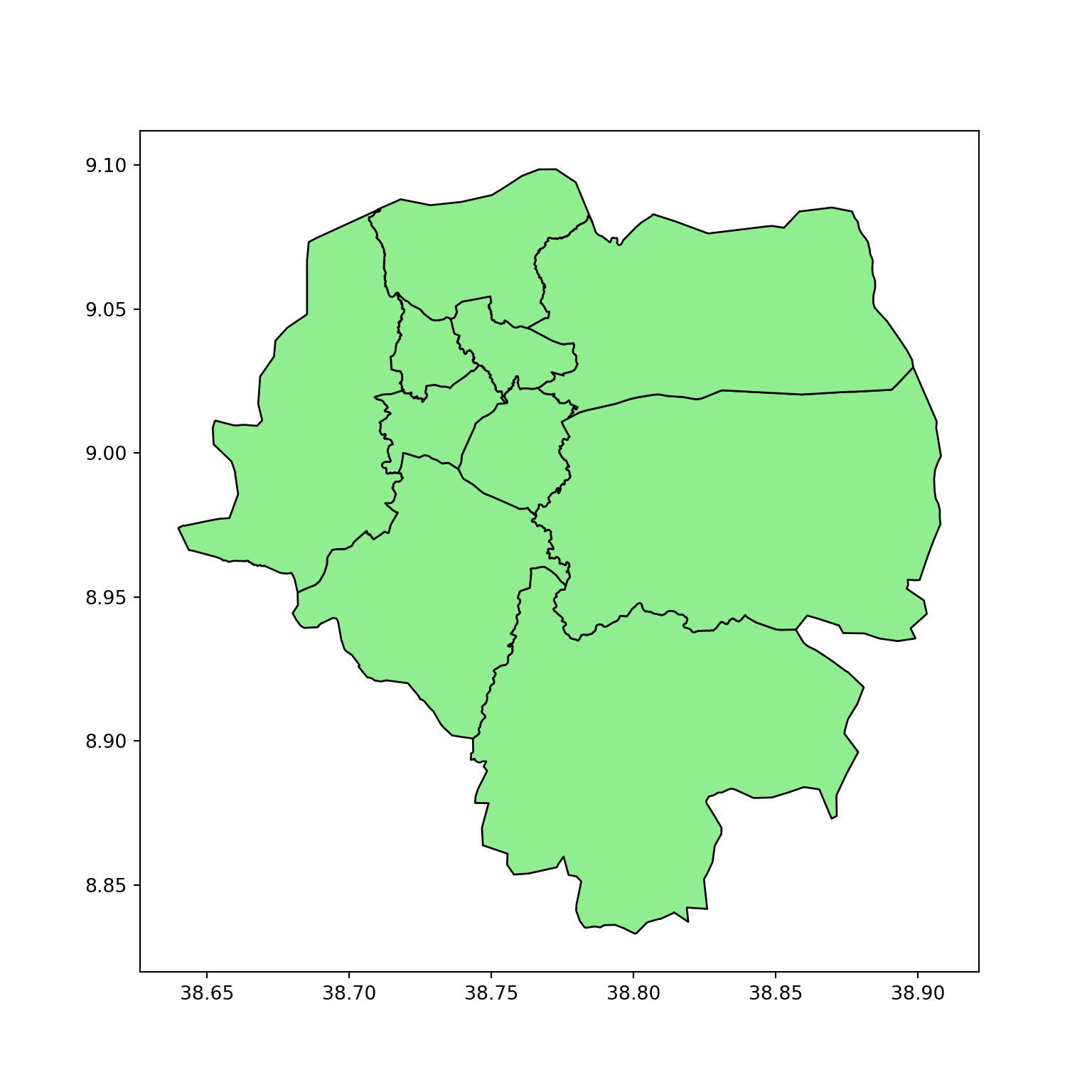
We filtered out any point-based geometries and kept only the actual polygon shapes. This gives us the physical boundaries of Addis Ababa’s sub-cities.
The next question I had was what my clustering criteria should be. I searched for a good and clear population density data for Addis Ababa. When all my tries yielded no result, I decided to plot shops, building, and road networks so as to see which properties can come close to showing population density in Addis Ababa.
#getting shop features
place = "Addis Ababa, Ethiopia"
tags = {"shop": True}
poi = ox.features_from_place("Addis Ababa, Ethiopia", tags)

#getting building features
tags = {"building" : True}
buildings = ox.features_from_place(place, tags)
buildings = buildings[buildings.geometry.type.isin(["Polygon", "MultiPolygon"])]

#getting road networks
G = ox.graph_from_place(place, network_type="drive")
edges = ox.graph_to_gdfs(G, nodes=False)
Plotting shops, buildings, and road networks.
- Shops are blue points.
- Buildings are shown in green, small polygons.
- Road networks are presented in red line strings.
#plotting shop, buildings, and roads to see which features come close to showing population density
fig, ax = plt.subplots(1, 1, figsize=(10, 10))

edges.plot(ax=ax, edgecolor="red", linewidth=0.5, alpha=0.5)
buildings.plot(ax=ax, edgecolor="green", alpha=0.3)
gdf_filtered.plot(ax=ax, edgecolor="black", cmap="Pastel2", alpha=0.5)
poi.plot(ax=ax, markersize=8, color="blue", zorder=3)

plt.show()
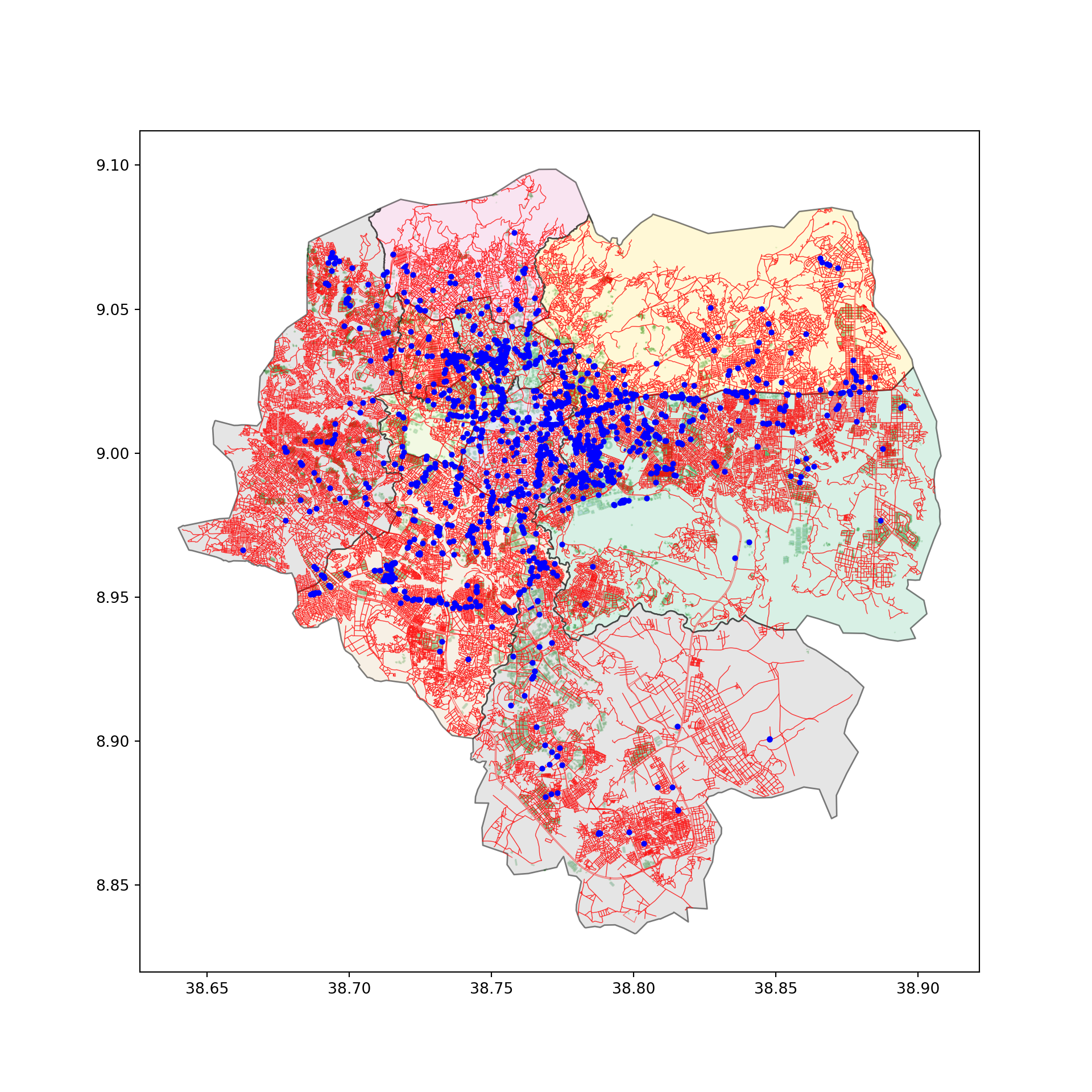
From this plot, I chose to proceed with road networks. Why did I choose roads?
- The shop counts are really lower than I expected, with even lower kiosk numbers.
- As we can see, some buildings not shown by the green plot are actually covered by the roads’ structure.
Step 2: Prepare Data for Clustering
#taking the roads line column only
edges = edges[["geometry"]].reset_index(drop=True)
edges.head()
                                            geometry
0  LINESTRING (38.74686 9.022465, 38.74682 9.022...
1  LINESTRING (38.74682 9.022353, 38.74681 9.022...
2  LINESTRING (38.74681 9.022292, 38.74680 9.022...
3  LINESTRING (38.74680 9.022231, 38.74679 9.022...
4  LINESTRING (38.74679 9.022170, 38.74678 9.022...
In geospatial analysis, before any calculation that concerns distances, it is vital to check whether geometry is in degrees or distance-friendly units (like meters).
#checking the crs
edges.crs
<Geographic 2D CRS: EPSG:4326>
Name: WGS 84
Axis Info [ellipsoidal]:
- Lat[north]: Geodetic latitude (degree)
- Lon[east]: Geodetic longitude (degree)
Area of Use:
- name: World
- bounds: (-180.0, -90.0, 180.0, 90.0)
Datum: World Geodetic System 1984
- Ellipsoid: WGS 84
- Prime Meridian: Greenwich
As we can see, the crs is in WGS 84, which uses degrees rather than meters. It needs to be converted.
edge_points = edges.copy()
#converting to meters crs (UTM zone 37N for Ethiopia)
edge_points = edge_points.to_crs("EPSG:32637")
edge_points.crs
<Projected CRS: EPSG:32637>
Name: WGS 84 / UTM zone 37N
Axis Info [cartesian]:
- E[east]: Easting (metre)
- N[north]: Northing (metre)
Area of Use:
- name: World - N hemisphere - 36°E to 42°E - by country
- bounds: (36.0, 0.0, 42.0, 84.0)
Coordinate Operation:
- name: UTM zone 37N
- method: Transverse Mercator
Datum: World Geodetic System 1984
- Ellipsoid: WGS 84
- Prime Meridian: Greenwich
To make calculations easier, I calculated the center of each road, taking the final coordinate.
# calculating the mid point of the road
# .centroid can pick a point outside the road for curved roads
# normalized=True means 0.5 refers to 50% of the line's length not absolute distance
edge_points["geometry"] = edge_points.geometry.interpolate(0.5, normalized=True)
edge_points["x"] = edge_points.geometry.x
edge_points["y"] = edge_points.geometry.y
edge_points.head()
                    geometry            x            y
0  POINT (486374.248 99780.41) 486374.247500 99780.414000
1  POINT (486373.924 99777.82) 486373.924000 99777.824000
2  POINT (486373.762 99776.53) 486373.762000 99776.525000
3  POINT (486373.600 99775.23) 486373.600000 99775.233000
4  POINT (486373.438 99773.94) 486373.438000 99773.940000
# convering to numpy array and scaling
X = edge_points[["x", "y"]].values
scaler = StandardScaler()
X = scaler.fit_transform(X)
We now have standardized x-y coordinates that allow us to perform distance-based clustering meaningfully. The next step is to conduct a simple KMeans clustering to cluster nearby roads together.
Step 3: Run KMeans Clustering
I used an elbow plot to determine the optimal number of clusters. This will accomplish one of our goals, i.e, finding the optimal number of clusters.
# plotting an elbow plot
distortions = []
K = range(1, 20)
for k in K:
    kmeans = KMeans(n_clusters=k)
    kmeans.fit(X)
    distortions.append(kmeans.inertia_)
plt.figure(figsize=(16, 10))
plt.plot(K, distortions, "bx-")
plt.title("Elbow Method for optimal K")
plt.xlabel("k")
plt.ylabel("Distortion")
plt.show()
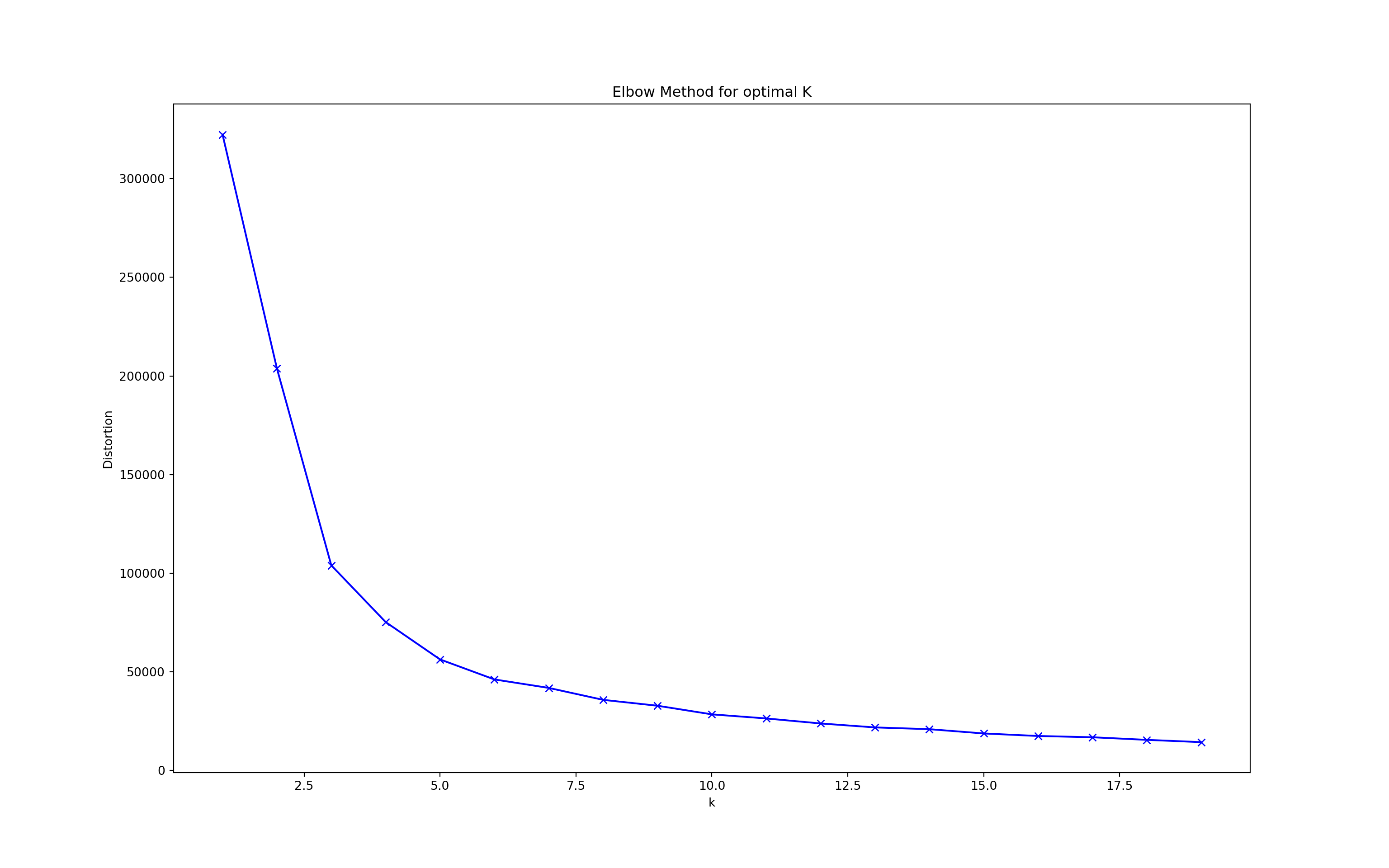
We apply KMeans with n = 5 clusters. You can change this number based on how granular you want the grouping to be.
# building and fitting KMeans clustering
kmeans = KMeans(n_clusters=5, random_state=42)
kmeans_7 = kmeans.fit(X)
kmeans_7.labels_
array([3, 3, 3, ..., 1, 1, 1], dtype=int32)
# creating a column with the clusters
edge_points["cluster"] = kmeans_7.labels_
edge_points = edge_points.set_geometry("geometry")
For the latter plots, I created a copy of the results, but with degrees instead of meters.
# converting to degrees
edge_points_latlon = edge_points.to_crs("EPSG:4326")
The next thing I did was create a simple plot to visualize the clusters.
#Kmeans plot
fig, ax = plt.subplots(figsize=(10, 10))
edge_points_latlon.plot(column="cluster", ax=ax, cmap="tab20", markersize=50)
gdf_filtered.plot(edgecolor="grey", ax=ax, facecolor="none", linewidth=1)
plt.title("Road Clusters by Density and Proximity")
ax.set_axis_off()
plt.show()
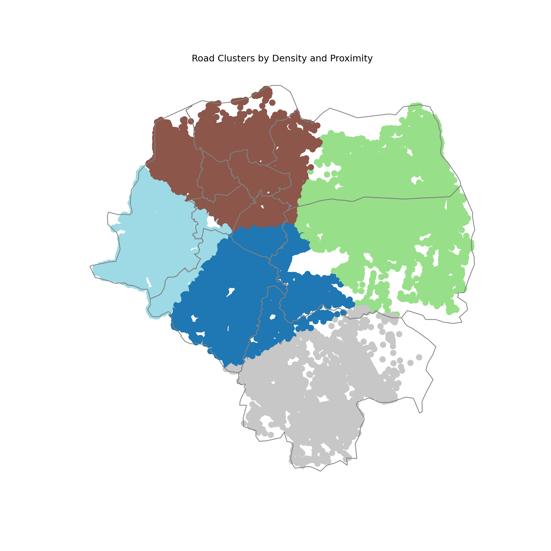
We can now fulfil another one of our goals. We can find the center of the clusters. I used these results in the interactive plots that I will talk about later.
#Extracting cluster centroids
cluster_centers = scaler.inverse_transform(kmeans.cluster_centers_)
cluster_centers_gdf = gpd.GeoDataFrame(geometry=gpd.points_from_xy(cluster_centers[:, 0], cluster_centers[:, 1]), crs="EPSG:32637")
cluster_centers_gdf = cluster_centers_gdf.to_crs("EPSG:4326")
cluster_coords = cluster_centers_gdf.geometry.apply(lambda pt: (pt.y, pt.x))

cluster_coords
0     (9.012345, 38.765432)
1     (8.987654, 38.712345)
2     (9.045678, 38.798765)
3     (8.956789, 38.689012)
4     (9.023456, 38.734567)
dtype: object
Step 4: Evaluating the Model
We use the Silhouette Score, a metric between -1 and 1 that tells us how well-separated the clusters are.
score = silhouette_score(X, edge_points["cluster"])
print(f"Silhouette Score: {score:.2f}")
Silhouette Score: 0.45
-
A score closer to 1 indicates strong, distinct clusters.
-
A score closer to 0 indicates overlapping or indistinct clusters.
A Silhouette Score of 0.45 means our clustering model is moderately good — not perfect, but not bad either. Some clusters may be too close or not clearly defined.
Step 5: Creating an Interactive Plot
Finally, the visualize the reults I got in a better way, I used plotly to create an interactive map that overlays the clusters on the google-style map that also shows the center of each clusters. You can click the link exactly below this code to see this final result.
# Convert clusters to DataFrame
cluster_df = pd.DataFrame({
    'lat': edge_points_latlon.geometry.y,
    'lon': edge_points_latlon.geometry.x,
    'cluster': edge_points_latlon['cluster'] + 1  # Clusters start from 1
})

# Create base scatter map
fig = px.scatter_map(
    cluster_df,
    lat="lat",
    lon="lon",
    color="cluster",
    color_discrete_sequence=px.colors.qualitative.Plotly,
    zoom=11,
    height=800,
    title="Addis Ababa Road Clusters",
    opacity=0.3,
    hover_data=['cluster'],
    map_style="open-street-map"
)

# Add cluster centers with prominent markers
centroid_df = pd.DataFrame({
    'lat': [pt.y for pt in cluster_centers_gdf.geometry],
    'lon': [pt.x for pt in cluster_centers_gdf.geometry],
    'cluster': [f"Cluster Center {i+1}" for i in range(len(cluster_centers_gdf))]
})


fig.add_trace(go.Scattermap(
    lat=centroid_df['lat'],
    lon=centroid_df['lon'],
    mode='markers+text',
    marker=dict(
        size=24,  # Larger size
        color='darkorange',  # Vibrant color
        symbol='triangle-up',  # Distinct shape
        opacity=1
    ),
    text=centroid_df['cluster'],
    textposition="top center",
    textfont=dict(
        size=30,
        color='white'
    ),
    hoverinfo='text',
    name='Cluster Centers'
))

# Configure map view
fig.update_layout(
    mapbox=dict(
        center=dict(lat=9.03, lon=38.74),
        zoom=11,
    ),
    margin={"r":0,"t":40,"l":0,"b":0},
    showlegend=True,
    legend=dict(
        yanchor="top",
        y=0.99,
        xanchor="left",
        x=0.01
    )
)

# Style regular points
fig.update_traces(
    marker=dict(
        size=4,
        opacity=0.3
    ),
    selector=dict(mode='markers')
)

fig
You may have to wait a bit to see the full results depending on your internet connection.
This map can be helpful in a real-world sampling application of these clusters. You can get the gps location of each point (road center) and information on to what cluster it belongs by just hovering your cursor over the point. You can see the cluster centers written in white. You can zoom in and see their exact location and around where they are found.
Conclusion
This workflow helps uncover potential alternative ways to group regions in Addis Ababa beyond administrative borders. It’s especially useful when official boundaries are outdated, inconsistent, or not granular enough for your project.
⚠️ Limitations & Future Work
-
This clustering only considers geographic centroids.
-
It ignores population, income, infrastructure, and social indicators.
-
You should use this as a starting point, not a definitive method.
✅ Suggested Improvements
-
Add population density from census or raster data
-
Include road networks, access to services, or land use types
-
Explore more flexible clustering (e.g., DBSCAN, HDBSCAN)
Thanks for reading! You can get github links to this project just below the title of this post. Feel free to adapt and build upon this! Do let me know if you found this interesting.